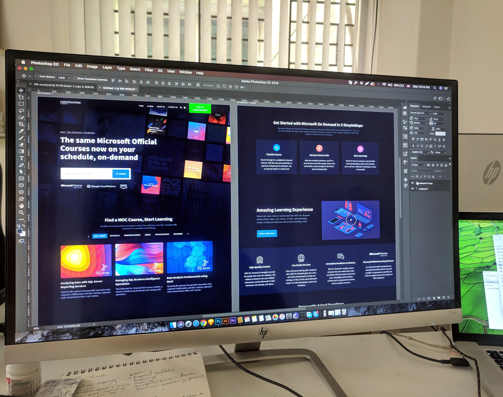
Design is usually the line item that gets cut first, on the assumption that it is the decoration applied after the real work. That assumption is expensive. For most businesses, the interface is the entire sales conversation — it is the showroom, the salesperson and the receipt, all at once, and it is having that conversation with every visitor whether or not anyone designed it to.
The judgement happens before the reading
Research on first impressions has been remarkably consistent for two decades: people form a durable opinion of a website's credibility in roughly fifty milliseconds. That is faster than they can read your headline. What they are responding to is visual — spacing, typography, colour, hierarchy, whether the layout feels considered or assembled.
The uncomfortable implication is that a visitor decides whether to trust your business before they have evaluated a single claim you make about it. You can have the better product, the better price and the better team, and lose to a competitor whose site simply looks like it was built by people who care.
Users don't articulate design quality. They articulate trust — and then they attribute it to something else.
Friction is a tax you charge yourself
Once a visitor is willing to act, every obstacle between intent and completion costs you a percentage of them. This is where UX stops being subjective and starts being arithmetic.
- Each additional required form field measurably reduces submissions — most enquiry forms ask for two or three things they never actually use.
- A checkout that demands account creation before purchase loses a meaningful share of ready buyers.
- Unclear pricing pushes the decision into an email exchange, and most people never send the email.
- Slow pages compound all of the above: the visitor who leaves at three seconds never sees the well-designed page underneath.
None of these are aesthetic problems. They are revenue problems that happen to live in the interface.
What intentional design looks like in practice
Good UX is not a style. It is a set of decisions about what the visitor should do next and how obvious you are willing to make it.
One clear action per screen
A page offering five equally-weighted choices is a page that has outsourced its strategy to the visitor. Decide what the primary action is, give it visual priority, and let everything else be secondary.
Say the thing plainly
Interface copy is design. "Get a quote in 24 hours" outperforms "Submit" because it answers the question the visitor is actually asking, which is what happens after they click.
Design for the phone first, genuinely
Most Kenyan traffic is mobile, often on a mid-range Android over a variable connection. A layout that only resolves properly on a designer's laptop is not responsive; it is untested.
Where design debt accumulates
Almost no site is badly designed on purpose. It gets that way incrementally: a banner added for a promotion that never came down, a fourth call-to-action added because a stakeholder wanted one, a form field added to capture data nobody has since looked at. Each individual decision was defensible. The accumulated result is a page that asks the visitor to do six things and gets them to do none.
This is why design work is not a project you finish. The useful discipline is periodic subtraction — going through the interface and removing anything that no longer earns its place. It is the least popular meeting in the calendar and reliably one of the most profitable.
The other place debt hides is in the gap between the marketing site and everything after it. Businesses invest heavily in the homepage and then hand the customer off to a booking flow, a payment page or an emailed PDF that looks like it came from a different company. Trust built over three carefully designed screens is spent in one careless one.
Treating design as an investment
The return on interface work is unusually easy to observe, because the baseline is already running. Fix a confusing checkout and the completion rate moves within a week. Rewrite a value proposition and the bounce rate responds. Cut a form from nine fields to four and the lead volume changes overnight.
None of that requires a redesign. Most of the interface improvements we make for clients are small, specific and measurable — which is precisely why they are worth doing continuously rather than every three years in one expensive push.
That is the argument for treating design as infrastructure rather than polish. It is the part of your business that talks to the most customers, works the most hours, and never has an off day — provided somebody designed it on purpose.